Pantone 2018 Color Trends
- houseofinspirations

- Feb 23, 2018
- 2 min read
Updated: Feb 16, 2020
It is too cold and dark here in Ireland and I am so ready for bright colors and that's exactly what 2018 color trends will be as per the Pantone Color Institute.Institute known as “global color authority” and the provider of professional color standards for the design industries,has forecasted the colors that will be trending in 2018.

Image Credit: House Beautiful
Eight Palettes that we can see trending in 2018 are :
Resourceful: A palette made up of complementary blue and orange colors. “This is quite an interesting color combination,” said Leatrice Eiseman,Executive director of Pantone Color Institute. “It combines warm and cool tones that you just can’t avoid looking at.”

Image Credit : House Beautiful

Image Credit : Laurel Bern Interiors
Moving over from pastels to intense color will be a standout trend we can see this year.This palette is about mixing bright colors together to create a strong look.Try textures and patterns to layer the look with a bit of neutrals to ground the look.
Verdure: Vegetal colors like Celery are combined with berry-infused purples and eggshell blue, symbolic of health, in this palette.

Image Credit : The Spruce

Image Credit : Digs Digs
Playful: Add something special to your room by incorporating "Playful" color palette.Think "Minions." Bright yellow, lime popsicle, Green flash and blue skydiver come together for this color scheme. "People need to stop and smile," said Eiseman.


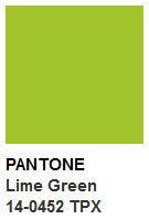


Image Credit : Ideal Home

Image Credit : theydesign
Discretion: Playful's alter ego. Subtle hues such as Elderberry and Hawthorne Rose offer a new sense of strength. "Pink has developed more power than ever before," said Eiseman.

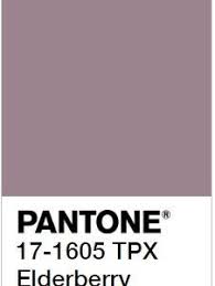

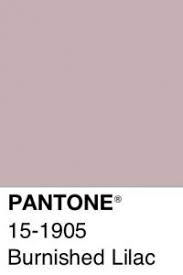

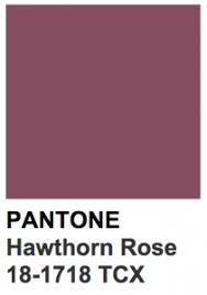

Image Credit : CupCakes for Breakfast

Image Credit: Murals Wallpaper
I am totally loving this crushed,buttoned wallpaper.What a way to add luxury to your space !!!
Far-fetched: With warm, earthy hues such as Cornsilk Yellow blending with rosy tones, this palette "reaches out and embraces many different cultures," said Eiseman.


Image Credit: BHG

Image Credit: BHG
Intricacy: A palette of neutral metallics (AKA, the "new neutrals") with accents of dramatic Holly Berry red and yellow Sulfur.

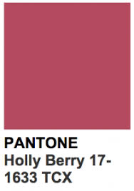

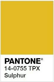

Image Credit: Phoebe Howard Interiors

Image Credit: Nashdomik
Intensity: This is an eclectic mix of colors that evokes a sense of strength, power and sophistication, all balanced with black and gold. Drama, Drama, Drama !! The intensity is everything and more, using deep, bold colors to create a palette to be considered. The classic colors, such as blue and plum, blend in orange, deep red and gold for a “certain strength, depth and complexity.”

Image Credit: House Beautiful

Image Credit: Home Design Lover
TECH-nique: Bright turquoise, pink and purple colors anchored with Brilliant White and Frosted Almond nod to technology. This palette is all about hues "that seem to shine from within," said Eiseman.

Image Credit: Home Decor Ideas

Image Credit: Phoebe Howard Interiors
Weather prediction for Ireland says that it will be cold in the coming weeks too.So till then I am going to enjoy looking at these colorful images.Put color into your space and your life !! The intense color awakens, animates, lures our mood!


Comments